In the Artist Spotlight series of blog posts, The Layered Onion highlights an artist in the community. We’ll get a chance to learn more about them and their work.
In this post we are featuring Melissa Smith Kennedy (she).
Melissa Smith Kennedy is a self-taught mixed-media collage artist based in Charlottesville, Virginia. She has always enjoyed art, but decided to pursue it in earnest in just the past few years. Melissa copes day to day with autism and PTSD, and finds making collages helps to keep her balanced.
Melissa did a Q&A with The Layered Onion, talking about her art:
What first drew you to art?
I don’t remember a time when I wasn’t interested in art. One of my earliest memories is of my mom reading book after book to me while I studied the illustrations. Textures were particularly fascinating—how could marks on paper look so much like kitten fluff or tree bark or bear fur that I could almost feel them? That was magic, and I wanted to know how that type of magic was made.
I’ve always liked creating. Over the years I’ve dabbled in practically every kind of art or craft there is. I’ve drawn, painted, learned to dye and spin my own yarn, sculpted clay, made paper, learned needlework and printmaking. I think collage is my favorite because of its simplicity—just paper and glue, readily available materials, but there’s so much those simple tools can do.
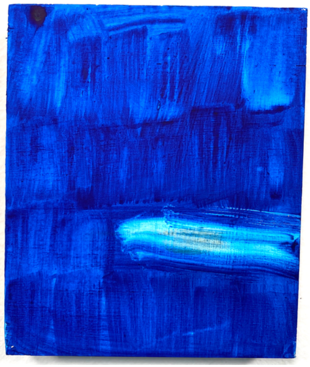
Melissa Smith Kennedy, Lesson One. Vintage papers, dictionary and magazine on mixed-media paper. 2022.
How would you describe your artistic style?
Playful, often with a dark undercurrent. I like freeing images and shapes from their given context and letting them interact with each other in new ways. Sometimes they have surprising things to say to each other. Sometimes they make me laugh.
Composition and fitting pieces together is an important part of your work. How do you decide what goes where? Are you always collecting fragments as inspiration?
I am blessed/cursed with an overly analytical brain—I like to know everything about everything, facts and data and how things work and why. I love reading and research and theorizing, taking things apart to see how they work. But sometimes that leaves me spiraling with a lot of noise in my head. Too much of that leads to depression. Working at art, working with my hands and focusing on images rather than words quiets that side of my head, reminds me how to play and tune in to emotions. I have to turn off that analytical brain when I’m working on a collage, otherwise I get hung up on trying to make the work mean something, or worrying about the composition, or if the colors are okay … I get tangled up in details. When I just let go, stop thinking in words and just open myself up to image and color and pattern, I feel like I’m following where inspiration leads instead of controlling it myself. I really love the feeling of that state of flow.
I have an enormous stash of pages torn from magazines, patterned paper, bits of ephemera, and so on. I’m always on the lookout for anything that might be used in a future collage, and I’m not above dumpster diving for old wallpaper samples. I also have far more old photographs than any one person needs, bought in an unfortunate eBay spree during a hypomanic episode. Since then, I’ve limited myself almost exclusively to materials I can get for free. People are usually thrilled to donate their old magazines for artistic purposes.
Where do you draw inspiration from?
Everywhere and nowhere. Honestly I feel like I’m just along for the ride when I create collages. I flip through papers and images I’ve already cut out, put them next to each other, shift them around, and notice patterns and feelings. I try to keep it instinctive because when that analytical side kicks in, it stomps all over creativity and tries to impose meaning onto the page instead of letting it develop organically. I have a terrible time trying to create when given a prompt; it just doesn’t work for me that way.
You have an interesting eye for color. Do you approach a piece with a certain color in mind or let the pieces speak to you or a combination of both?
This is going to sound strange, but sometimes I use a color for its sound. That’s how it seems to me, that sometimes I need to put a loud triangle or a humming circle into the piece. I don’t have true synesthesia, but that’s the best metaphor I can think of. I let the piece tell me what it needs.
Melissa Smith Kennedy, Miss Alternate Universe. Mixed-media substrate, magazine images. 2022.
You often utilize human shapes and combine them with abstract colors or patterns. For example, a human-spaced cutout filled with a cosmos pattern over a photo. What inspires you about human shapes?
I find I keep including portals and frames in my work, and the human shapes are both. I like playing with those ideas. Portals, of course, are doorways to somewhere else, and frames are a way of focusing the viewer’s attention and privileging what is in the frame. When we take the human out of the image, what’s left behind? Who are we, beyond our bodies, our faces in these spaces? Or what else is there in the space when the human, the former focus leaves—what pulls our focus then? What happens if the individual slips out of the frame, or breaks it? What is the frame? I like the questions.
One of my favorite poems, “Keeping Things Whole” by Mark Strand, begins:
“In a field
I am the absence
of field.
This is
always the case.
Wherever I am
I am what is missing.”
I love that contradiction: I am what I am not. I’m trying to explore that in some of these collages.
–
Thanks for sharing your magic with us, Melissa! You can see more of Melissa’s work on her Instagram @paper_loves_glue.
Note: Be advised there is potential triggering imagery in this piece.
In the Artist Spotlight series of blog posts, The Layered Onion highlights an artist in the community. We’ll get a chance to learn more about them and their work.
In this post we are featuring Jocelyn (Joce) Leo (they/she).
Joce is a multi-media artist and survivor navigating being human. Joce works a lot with self portraiture as well as collages. They often combine visual and textual art to better tell a story and elevate their pieces. Due to the personal and serious nature of the concepts covered, Joce lists all of their work under a content warning.
Joce did a Q&A with The Layered Onion, talking about their art:
How would you describe your artistic style?
i tend to make work with whatever media or style that i enjoy working with at that moment in time, and this changes a lot. i tend to always come back to intertwining photo, sculpture, collage, and text-based media together in my work, and i enjoy working with negative space, black-and-white or muted color schemes, short bursts of text, self-portraiture, and body-focused art. for me, the theme and subject matter tends to inform the style that i employ. i want my work to be hard to view at times, but i also want to balance that with care and compassion for who is viewing my work.
How do you approach your photographic pieces?
photography meets me where i’m at. most of my photographic pieces have been shot on days that i’m having a hard time. focusing on composing an image (specifically self-portraiture) allows me to express myself with my body in a way that is not through utilizing my eating disorder. i am often thinking about how to talk about pain and suffering through body-focused self-portraiture because my eating disorder serves that same purpose. in terms of how i logistically take photos, i shoot against a blank wall so that i have space to project words and other elements (because this has lately been an important tool for me), and i set up a tripod. i also tend to think about how to compose a self-portrait that is less about ME, and more about the theme of the work. my hope is that my photographic pieces are less to do with me and more to do with shared experience, a way of entering into an experience that i share with many, many other people.
Jocelyn Leo, Systemic Girl. Digital photography with analog collage elements. 2022.
What is it like working with models for your art? Do you act as a director?
much of my work lately has been self-portraiture, so i tend to direct myself. this can be really awkward to know how to position my body, almost at times more awkward than it is to work with models. working with models is something that i absolutely love! i don’t necessarily act as a director because i tend to like to photograph people when they are engaging with themselves in a natural way. sometimes, i’ll give people a general direction like, “can you look at the camera?” or “turn your body X way.” i think a part of what i enjoy about working with other people in photos is letting people find their own comfortability and authenticity in front of the camera and allowing them to know that they have autonomy. there are also so many times that i want to photograph people in my life but don’t know how to broach it because i worry people will change how they present when a camera is pulled out!
How does inspiration usually strike you?
injustice is where much of the inspiration for my work stems from. absolute rage towards the systems that are supposed to help us (and don’t), absolute sadness for our inner children and teenagers who were never heard or believed or listened to, absolute terror towards what our society is headed towards, and absolute frustration that there are so many people who engage in some level of being complicit with a greater harmful system despite having good intentions (including, in the past, myself). inspiration comes from my need to enter the advocacy scene while also knowing that i don’t want to fall into the category of “inspiration porn,” because my artwork (and no one’s artwork) is more important when a person is “fully healed” (if there is such a thing). inspiration also strikes me when i spend time with the people that i love. the genuine, loving platonic intimacy that i witness on a daily basis with my friends, classmates, mentors, clients, and even sometimes strangers inspires me to create art because they remind me that making art is a powerful tool against losing our gentleness.
You combine textual with visual art. How do you determine if a certain piece needs text?
i actually see my visual art and textual art as very separate while i’m creating them, but then when i create an image, i see the overlaps in themes in my poetry and textual work. then, i choose to combine them through projection or through editing software. i tend to add text where i think the image does not tell enough of the story and needs to be more “literal.” i tend to be very literal in my artwork in an attempt to not shy away from difficult conversations — we do enough of that as humans. text is very important in most of my visual art!
You also work with light and projection. How do you determine appropriate lighting?
lately, i’ve been very interested in how to capture shadow with lighting. using a projector has been perfect in terms of allowing me to incorporate text or another image into one image, but also to create dramatic shadows. finding the proper sources for lighting is something i struggle with and something that i’m still learning about!
Jocelyn Leo, untitled. Digital photography. 2022.
With your collages, how do you determine mediums and the composition of what you put where?
what i enjoy most about making collages is their physical tactility; the actual act of cutting out photography found objects, magazines, poetry, etc. and gluing it to a surface. i don’t usually pre-plan my collages in terms of mediums or compositions. throughout my days, i will find objects, found materials, magazines, etc and save them for future collages. i will also print my photography, poetry, drawings, scanned objects, images of sculpture work, etc and save those. i like to not think too much when i place bits and pieces down. sometimes, i’ll choose to not even glue everything down and just place elements directly on a scanner. i like that i can move elements around and create an entirely different composition out of the same elements and artwork.
–
Thanks for sharing, Joce! If you would like to see more of Joce’s work, you can reach out to them – @lynlightstheirway – on Instagram.
Note: Be advised there is strong language in this piece.
In the Artist Spotlight series of blog posts, The Layered Onion highlights an artist in the community. We’ll get a chance to learn more about them and their work.
In this post we are featuring Devon McKnight (they), an artist based in North Carolina.
Devon is a prolific painter with an innovative eye for color. Devon describes their work as coming “out of a history of formality and a desire to break apart the structure of a system, specifically Painting. I question what makes up a painting: how it is formed, what it can be, what it can mean, where it comes from.
I consider the formal in its most basic existence, separating line, color, shape. Using these elements I arrange and rearrange, coming upon more questions within these fragile relationships. There is a lot of looking that takes place. After putting down paint, I sit and look, trying to see the forms and spaces that have been shaped and those that could be.
I try to stay in this liminal space of transience. It is a place of wonder and precarity, lines and forms falling apart, barely stable. To not know, to be insecure in meaning, draws out openness and a welcoming of fear and doubt. There is strength in the pursuit and in the mere existence. There is energy in the endless exploration that transfers to and draws from everyday life and I hope enters the lives of those that encounter this work.”
Devon McKnight hails from Greensboro (Climax, really), North Carolina where they studied Painting at the University of North Carolina at Greensboro. They traveled to California seeking a new landscape and completed their Masters of Fine Art at San Jose State University in 2015. After graduating Devon lived and worked in East Oakland but has since returned home to North Carolina where they help run a community arts organization. McKnight’s work has been shown throughout the United States, as well as Australia. Their practice comes out of a history of formality within painting and a desire to break apart or unmap the structures of our dysfunctional systems: social, artistic, political, educational. Devon has curated their own and other artist’s work through an artist collective called Spare Room and is a contributing writer to The Coastal Post.
Devon did a Q&A with The Layered Onion, talking about their art and community work:
What first drew you to art?
Art has always been embedded in my life. Our house was filled with art, no actual paintings that I remember, but reproductions of Georgia Okeefe paintings, I think I remember a print of a Bruegel painting?, weavings, a family photo wall, and hella books. Going to see films as a family was a thing, even as a child. My mother taught high school English so the arts were always being discussed.
Both of my parents are creative, my mother as a teacher and writer and my dad in less obvious ways, in his ability to fix anything and build anything…he’s into woodworking now after retiring from being an electrician. The way he thinks through a problem…I remember when he’d help me with my math homework, he never did the steps like my teacher taught us but he still got to the right answer. And music, my father taught me about music. We grew up listening to it all, and talking about it. My Aunt is a doctor but she’s an artist. When I was little she was making ceramic jewelry and now she’s a pro knitter and even my grandmother was making ceramic pieces when I was a kid. It fed into my brothers as well. One is a creative director and has been one all of his life even before being paid and given the title. The oldest is a botanist that works as an urban designer/city planner. He’s the otherworldly type, always spaced out studying the flora and fauna. So all that, to say I don’t think I was really drawn to art, rather, it is of me. I don’t know what it’s like to not have a world centered around the arts…books, music, film, stories, poetry, painting, all of it.
I was a kid that played outside, so I wasn’t really painting or drawing early on, but I was deeply imagining. As a visual learner, I was probably thinking creatively from an early age, but I didn’t really step into capital A art until college. I was probably making art in various ways and just didn’t consider it art; playing guitar in high school, cutting down a tree and carving a totem pole for my senior project, writing poetry and participating in writing contests, helping create the yearbook each year, designing layouts. However, I remember struggling in my art classes in high school, lacking the skills to achieve what I had in mind.
Devon McKnight, untitled. 8x6in, pigment and medium on panel. 2022.
You have an eye for color and texture. Why painting?
I want to say it’s what I’m good at. To get your BFA you have to take courses in all the mediums and I struggled with all of them except painting. Everything except painting had too many steps between me and the surface, me and the thing. I like that with painting it’s very direct and immediate. And the colors, I could just eat them. They’re so beautiful and full and I can literally feel parts of my body tingle when I use certain colors. I remember first learning to mix colors with oil paints, like truly. I would spend whole days just preparing my palette for a painting, mixing the colors I’d need, each shade, each tint, 10 shades of red, working with the cools and warms, realizing how much a speck of white can alter a color, making your own black from blue, yellow and red. It’s fucking incredible. The way colors sit next to each other and adjust or how they shine through one another on the canvas, I mean you see all of that in nature when looking at tree leaves for example or in us as people and how we shift next to each other. Painting changes the way you see the world, the way you relate to it.
I remember when I was 16, for my birthday I got to go see the Monet exhibition at the local museum. I was floored. I mean come on, the color! I see his paintings as color, period. Sure it’s cathedrals and hay stacks, but what makes your heart explode is the way he puts down color, which is texture, the marks. When I go to see paintings, I go for the marks. I want to see how it was made, how the artist put down their marks and wonder why. It’s like studying their imprint, reasoning, choices, and it’s all tied to their environment, time period, personhood.
Halfway through undergrad I got really depressed. I was attempting to major in Graphic Design, which I was failing at. I knew I was creative, but I didn’t know how to move forward with it and I thought graphic design was the ticket to a job in the arts. I was terribly wrong. I stopped going to classes and barely left the house. Then, a friend said she was going to Europe for a few months, sort of tagging along with a study abroad group and I decided to go with her. I cashed in stock that had been building since my birth to support the trip. We backpacked through Europe for a month and then lived in Prague for 3-4 months. When I got back, I switched my major to painting. I’m not sure if it was the exposure to Art centers (and art colonizers) of the world or the adventure and independence I experienced that gave me permission to follow this path. The genius thing about art making is that it’s so of the self. You gravitate to what works for you like a magnet, if you allow it or are able to make space for it. For me, I want to put down color on a surface. I want to see the mark that my brush makes. I could do just that for multiple lifetimes. But it took me a long time to be okay with that. To own it. Even with 2 degrees in painting, I still feel shy about it.
You talk about line, color, and shape – sitting with them and rearranging them. Do you have a specific process that you go through?
I’m in it for the process. Painting is the making, not the thing. I’ve moved through different mediums: oil, watercolor, acrylic, found materials, collage, but the process is the same, always about using the elements of composition: line, color, shape, to ask questions or question things. So I’ll put down a mark and then I’ll react to it. The idea is to get to a space where I’m not thinking, I’m painting. It takes a lot of work to get to that space. There’s so much time spent on fretting, failing, faking it, realizing I’m faking it and covering it up, being insecure, getting hella mad and frustrated and doubting myself, asking questions, reading, listening to other artists, looking, a lot of looking, wondering, pep talks, and of course all that feeds into the work. So once I’m in that non-thinking space, it can kind of just come out. There are some days where I walk in and I can step right into that space and there are some spans of time where I stay frustrated for days on end and usually that means I need to switch things up, try something new or it’s just working things out. I work pretty quickly because I’m after immediacy or of the moment, but this happens over long periods of time. Like right now I’m working on maybe 20 different paintings all at once. But I’ll probably be moving around them for a month or so. Some paintings are done in 5 minutes and some months and months.
Because I’m in the thick of the process currently, I’ll use “now” as an example. I switched up my mediums when the pandemic hit and I got a new studio space. I wanted to move away from watercolors on paper, which I’d been working with for the past 5 years. Acrylic has always been difficult for me, so I wanted to lean into that and see what I could discover. There’s been a long process of figuring out materials, learning about them and what I want from them, experimenting, finding the right brushes and surfaces and how to make all of that conducive to supporting an output.
So I landed on pure pigments, liquid pigment (the color is unbeatable) and I mix them with clear mediums that have a matte finish. This sort of “fixes” them to the surface. I had to learn that. Then I lay them down on wood panels. I can buy panels somewhat cheaply, but I’ve been working with my dad to build them out of Luan, a super cheap plywood. We buy huge sheets and cut them down to whatever size I choose and then he frames them in wood. They become these precious objects, handmade. I live with my dad so I’ve loved having this relationship with him as we troubleshoot. I can tell him what I’m needing and he can problem solve. Like, for a while we were using scraps from our wood floor to frame the panels. The finished pieces just look so interesting with that flooring on there, it’s hilarious to me, and one of a kind.
There’s that part of the process and in tandem, I’m making marks, figuring out how I want the paint to sit on the surface, which is so wild when I really think about it. There’s so much tension and contradiction. I am so in love with the mark that it’s really, really difficult for me to push or edit. I’ve been used to watercolor, which is all about that first mark and leaving it. So I think that has led me to this repetition of mark. But I’m trying hard to let go and dive in. This means, making marks on the surface that aren’t comfortable for me, covering them up, trying other marks, covering those, wiping it out, moving things around. But truly all that is difficult. So much of me resists it. I get frozen and of course I get scared. There’s a lot of fear. And I realize that sounds weird…to be afraid of a mark, but this is my heart, my deepest insides, my truest self that I’m investigating. I want to see something I’ve never seen before and that’s complicated because lots of times that process is really uncomfortable or I’m completely unsure about it and I just can’t tell if what I’m making is crap or I’m onto something. So that’s where I have to do a lot of sitting and looking and asking. And I definitely don’t do this enough. It’s sort of like how we are asked to look at ourselves…we don’t do this enough because it’s exhausting and oftentimes we just don’t want to go there, it’s too much, too painful. I know if you’re looking at my work and the beautiful colors you wouldn’t think pain, but change is painful isn’t it? Growth, that shit hurts and the only way to grow is to reflect.
I want to add that I have had support along the way. I have a mentor and friend who I speak with regularly. She was a professor in grad school and we got on so well we just stuck. She’s a painter too, as well as her son. We three have a regular chat where we share work, materials, artists and ideas. I have another friend who’s a painter and we chat everyday. Most of my friends are artists so that community is vital. I’ve been without it before and it was terrible, I felt lost. That is why I’m so incredibly excited about The Layered Onion and its specific community.
Some of your art seems to deal in symbols. It reminds me of hieroglyphics. Can you describe a little more about these pieces?
Oof, I’ll try. I started making the “glyphs” soon after I moved back to North Carolina from Oakland where I’d been living and working post grad school.
Devon McKnight, untitled. 11×8.5in, pastels on paper. 2019.
I decided to move home for a variety of reasons, but a big one was that my health was declining and I needed a support system. I had become increasingly physically weak, so it felt best to sit at a table and paint with the least amount of movement. I was making really small marks on 8.5×11 inch paper and working in sketchbooks. I found myself sort of grouping these small marks and building lists of them. It was a very repetitive process with small or minimal variances. It really took me out of my head, but also required focus or concentration, the kind I didn’t have to think or worry about. And I remember liking the way they sat together. You could see the individual as well as the grouping. I started to think of them as “in community”. Even within the “individuals” there were parts supporting each other or merging.
Feeling too ignorant about hieroglyphs, symbols and linguistics to really know what I’m talking about, I’ll say it’s on my mind. Hieroglyphs were an alphabet that made up the Egyptian language, right? I like the idea of images as the first written language. I think the paintings of mine you are referring to remind folks, and me, of hieroglyphs or language because of the format they’re in; a repetitious listing. It looks like, reads like, language or categorizing. I think that’s more evidence of process or thought process and maybe a comfortable format for me to work within. Painting is both a safe space of comfort for me and also a terrifying, challenging space that’s constantly shifting and moving and is infinitely boundless. Reflecting now, I started working in this way to form intimacy with myself. I was needing to go inward. These paintings I make are evidence of what’s going on within me and thus all around me. Trying to make sense of it all, pushing my understanding of existence, questioning everything, and when it’s really good, it’s beyond knowing. Isn’t that what artists do? We observe, take in, and then because we exist in the freedom of what art is, we can go into unknown places and make those places available to others through the work we make. What I love about painting, specifically abstraction, and most especially the work from my favorite painters, is how much we can express, convey, say or present with a color, a form, a line…space. The universality of it is everything.
In tandem with painting, I’m deeply investigating the systems we live within and how they show up in me or how I participate in them. I’m wrestling with rape culture, whiteness, patriarchy, fatphobia, anti-blackness, gender, sexuality, capitalism, ableism, etc. and of course this isn’t apparent in the work, but if bell hooks taught us anything it was to think critically. If we can start there, then it’s sort of like dominos. So when I am making marks, what guides me is the search for the unknown and the continuous and non linear process of getting “there” is what you see and what I believe is at the core of liberation. I love how I can make these forms that seem to exist in an in-between. We are so controlled in every aspect of our lives, but inside we’re limitless, if we want to be, and when we go here or exist in that space, it extends beyond us, radiates out and into others. When I can get to that space in painting, then the painting can serve as a reminder to me (and others) of that possibility.
You display some of your art with quotes. How do you pick what fits with the work?
Last year I was reading a ton; lots of bell hooks, Toni Morrison, Octavia Butler, Ocean Vuong and I would pull quotes from what I was reading. I mean, they’re all just so quotable. You want to savor each line because each line is so full. I was bringing these writers into the studio with me and sitting them beside the paintings I was making. Maybe trying to make connections or just seeing how they interacted. It’s more for my personal consumption, to help me in my own thoughts. I did this in grad school with music I was listening to while painting. And then I’ve done it a bit in a book I made where paintings are interspersed with quotes I pulled from my life…things I overheard people say, nothing deep, more like a nod to how we were living at a certain time. I usually have a long list of “writings” or quotes and I think the visual and textual just gravitate towards one another, or it’s a feeling, a curiosity, or a trying-on of sorts. In grad school, you know, we had to produce a written thesis along with an exhibition of works and instead of positioning my work in an art history context, I wrote a sort of memoir-ish prose that sat with the paintings, again, quotes or moments pulled from my everyday and deep past. I reckon I was giving them context. It sort of tied place and memory to all the unlearning I was going through at the time.
Tell us more about the community arts organization. What’s your favorite part about working with it?
I am the art + community coordinator for Center for Visual Artists (CVA) in Greensboro, North Carolina. We are located inside the city’s Cultural Arts Center which is home to 20 or so art non-profits. CVA has a gallery that shows mostly local artists year round as well as classrooms and a ceramic studio that hosts art classes for all ages. We work to make art and art experiences accessible to all.
My favorite part is most definitely the people. I get to work with all different kinds of artists, which can be difficult because so many personalities, but…so many personalities! Most, if not all(?) of my friends are artists and many of them I met or became close with through the CVA. We work with artists of all ages and all levels, so I get the privilege of having a front row seat to this community and I get to support them, shine a light, which most always creates ripples.
In this work I get to see the growth of an artist, their work and themselves. I see the confidence grow, the skill, the joy, the opportunities and in some cases they are growing their families at the same time and it feels full circle. Community is a buzzword these days, but that right there is community to me, to be amongst that growth and to do what we can to provide resources and support so it can continue and thrive. That is the goal. The relationships and community connectedness is life giving.
And my team. As a small organization and team of 3, we don’t have many resources, but we have a lot of freedom in our ideas and are united in our dedication to supporting artists. We continue to try new things, seeing what works, what doesn’t. And we work directly with the community to give them what they need. There’s so much collaboration going on, which is my favorite way to work.
I am a highly anxious person, for a variety of reasons, but when I allow myself to step back, I am reminded that I spend my days talking with artists and working for us. So many artists showed their art for the very first time at CVA, sold their first piece, bought their first piece, made their first piece or gained community. Art makes our world go round and as artists, we are severely undervalued, so to work everyday to uplift artists and art and in the town where I was born and raised?…Wow, what a life.
You also mention writing for The Coastal Post. What kind of pieces do you write?
We do studio visit write ups at The Coastal Post. I started when I was living in the Bay Area after Francesca Cozzone, one of the co-founders, visited my studio in grad school and wrote about my process. I began writing about the work of the artists in my life, aiming to choose artists who I feel could offer something different, whether it’s how they’re thinking or what they’re doing with their work…there’s usually a social aspect. And I look to spotlight artists who are somewhat in their beginnings. It’s been incredible to see them grow.
In Oakland I wrote about self-taught artist Wardell Mcneal who was making these incredible drawings on the subway during his commute and then would turn them into paintings, working in a corner of his tiny bedroom, teaching himself to paint from books. Wardell now has a studio outside of his bedroom and is represented by pt.2 gallery in Oakland. You should go look at his work and do a deep dive so you can see the drawings.
I continued writing articles once I moved back home to NC and I focused on the local artists here. Ashley Johnson is an artist in Winston-Salem and I wrote about her in 2016 after she released a series of incredible photographs, the first we had really seen from her. Then later I profiled an exhibition and performance she presented in Greensboro. She currently has a solo show in Brooklyn presented by The Coastal Post co-founder Nick Naber.
That’s the cool aspect of the Coastal Post. The co-founders bookend us from the 2 coasts, NY and SF, and the writers are dispersed around the country (and abroad), usually focusing on the artists relative to them. Connections get made and the visibility helps the art spread.
–
Beautiful and thought provoking words and art. You can check out more of Devon’s work on their website and Instagram @devonairess. Thanks for sharing, Devon!
In the Artwork Spotlight series of blog posts, The Layered Onion highlights a specific work by an artist in the community. These works could range from short stories to visual art to music and more!
Today, Danni Blackman (she/they) will be sharing her work “i miss my body.” Before we delve into the art, a little more about Danni in her own words:
“Hello! My name is Danni and I am a self-taught visual artist. I have been working with acrylics on canvas for almost 6 years.
The journey towards my style started when I was 17. I had a random urge to paint and collected the supplies I could find from my childhood leftovers. The goal was to paint a landscape, but as the process continued along, I noticed I was falling for the palette more than the painting itself. I began using my canvas simultaneously as the palette ever since.
I listen to live or recorded music, envision colors, and allow the brush strokes to be led by my awkward dance moves. I enjoy embracing the nonsensical. Creating for the sake of creation creates freedom.”
In a Q&A with The Layered Onion, Danni expands further on her style and her piece:
What led you to art?
Art is a therapeutic and soul feeding activity. I grew up with art. My Dad’s family is very artistic in nature – lots of music and I also have a few aunts who are painters. Being an artist is inherited for me.
When I was 17, I needed to paint and went to paint a landscape, that didn’t turn out at all like I imagined.
After, I was gifted a record player. The first album I had was “The Bends” by Radiohead and I listened to that while painting for at least a year. I started focusing on the palette and was inspired. I started painting sounds, which to me matched brush strokes.
You have an interesting process with sound and visuals. Can you describe what that is like?
It’s very mind’s eye but also instantaneous. I can vividly picture what colors go with the melody and the feel. It feels like I’m able to capture the energy and the essence of the sound. Sometimes I do full albums and sometimes just 1-2 songs. I play the album on repeat until it ends up on paper. You can see this in “i miss my body.”
Danni Blackman, i miss my body. Mixed media, acrylics, and cloth. 2020.
What inspired you for the piece “i miss my body?“
It started with an exercise book designed to get your creativity going. One of the thoughts was to paint or draw something that you know really well with your eyes closed. I painted my parents and I thought it looked cool but my Mom didn’t like it.
During that time I was gaining weight and going through an experience where I was just seeing myself changed. I didn’t feel like myself. I missed my body. The thought and feeling was in my headspace an unhealthy amount. With that in mind I painted over my mom’s face and painted the body in the piece. It reflected the disconnect that I felt between myself and my body. I didn’t feel connected.
I can’t help but ask – why hot pink for the upper right hand corner? Was it associated with sound? It keeps drawing my eye back in in a really interesting way as I try to see what I’m looking at.
That portion of the piece reflects the brain with a halo wrapped around it – the symbolism of losing my mind. This head is in the past becausethis body is gone. The brain was hard to paint and I hadn’t used hot pink yet so I incorporated it.
What mediums do you often use?
Acrylics are my favorite – they match my personality. They dry very quickly. They are adaptable and can be changed in many ways. Very versatile. I’m a very impatient person and watching paint dry is crazy making so I like how acrylics dry quickly.
I’m also getting into collage and starting to do mixed media. “i miss my body” has a choker necklace on the piece.
I was inspired by an artist (whose name escapes me) who repurposed trash that she found and made it valuable by transforming it in art. I’ve been incorporating things like broken jewelry and film since 2014. I also make zines that include visual art, collages, and poetry.
Do you have themes that inspire your work or that you find particularly impactful?
I really get inspired by my spirituality. I’m agnostic but feel very spiritual and connected to nature. I paint a lot about lessons I’ve learned or am learning. I have a series called “The Almighty is non-binary.”
I tend to start my pieces in the middle and I’m not sure where it will end. As I keep going it makes more or more sense. My subconscious is telling a vivid story and I’m not supposed to know what the beginning is until I do.
Anything else about the work that you would want to share or say?
With this piece or any piece tied to weighted experience, the process and result of painting makes it more livable. It becomes something I can appreciate and it helps me accept the thought. “i miss my body” was a big seed of self-love that I planted – you’re worth it and lovable.
Something we can all relate and aspire to – a goal to better understand ourselves and own our experiences through our art or hobbies. Acceptance is hard, but to quote Danni, “you’re worth it and lovable.”
You can see more of Danni’s work on her Instagram @danniblackmaaan or on her website. Her website has a unique display of her art using models – I highly encourage you to check it out!
In the Artist Spotlight series of blog posts, The Layered Onion highlights an artist in the community. We’ll get a chance to learn more about them and their work.
In this post we are featuring Haley Strassburger (they/she), a mixed-medium journaler. Haley has taken bullet journaling to the next level and has made both her daily tasks and powerful messages pop and come alive as art. She also is not afraid to mix in different materials to create what she calls “spreads.” It brings the work three dimensional – and sometimes engages your additional senses (note the olfactory addition in the below)!
Haley did a Q&A with The Layered Onion, talking about her art:
Can you describe your art style?
I consider my art style to be a mix of function and freedom— I love utilizing my bullet journal to keep up with day-to-day tasks, but I also love having a chance to be creative through a variety of colors, mediums, etc.
What’s your favorite part about journaling?
I think my favorite part of journaling is just how versatile it is; there’s no wrong way to create anything, and the ways in which journaling mixes writing, drawing, scrapbooking, and so many other activities really allows you to be as creative or rigid as you’d like. I’m physically disabled, and though my journaling isn’t nearly as precise as it used to be (I have hand tremors and mobility issues), I can still find new ways to express myself.
You have an extensive collection of stickers. How do you choose them and which spreads they belong in?
Haha, I love stickers, and I won’t lie when I say my collection is growing a bit out of control! At first, I mostly picked stickers up from Amazon and other big-box retailers, but lately I’ve started supporting a bunch of small businesses that I’ve discovered on Instagram and Etsy! I’ve been fortunate enough to work with a couple of small creators, like @bluemoon.paper, @noellepapershop, @rusticrose.shop, @lixing.co, and more— I have discount codes available in my bio on Instagram (@spoonie.bujo). I also am affiliated with my two favorite journal companies— @archerandolive and @notebook_therapy— and I have affiliate/discount codes in my bio as well.
Overall, I like to select stickers that fit my themes, whether that’s based on their colors, imagery, shape, or other factors. As I mentioned before, I’m physically disabled, so I also often use stickers to cover up shaky lines or other “mistakes”— or to insert artistic visuals that I can’t create with my own two hands!
What kind of markers/pens do you use?
Just like with my stickers, I tend to pick up pens and markers from everywhere! Lately, I’m a really big fan of @archerandolive’s Acrylographs and Calliograph pens, but I also just love a good fine-tipped colored pen from Staedtler. I’m left-handed, so I have to be very selective with my pens to avoid smearing or ink staining, and all of these options work great!
You have a good eye for color. What inspires you from a color perspective?
Thank you so much! I have synesthesia, which is a perceptual phenomenon in which colors often become associated with sounds, sights, sensations, and more; basically, if I’m listening to music, I often see a color appear in my mind that somehow connects to the music I hear! It’s considered an overlapping of mental processes (visual/auditory processing), and though it can be frustrating at times— because my brain can get a bit overstimulated!— it also allows me to have infinite color and stylistic options in my creations.
You are an extensive reader. Any recommendations for the crew from your recent readings?
I largely read poetry and nonfiction, particularly because I’m often really busy with my gender studies masters degree program— but I’m also a big fan of the classics (like Dracula and Les Miserables)! I’d definitely encourage checking out Dracula Daily, which is a new multimedia reading experience for Dracula (in which emails are sent out each day, in correlation with the book’s timeline!). My all-time favorite read is Crush, a collection of poetry by Richard Siken.
Haley gives us a great example of how art can be accessible and part of how we go about our daily lives. You can see more from Haley on her Instagram – @spoonie.bujo!
In the Artwork Spotlight series of blog posts, The Layered Onion highlights a specific work by an artist in the community. These works could range from short stories to visual art to music and more!
Today, Carrie Ravenscroft (she/her) will be sharing several images from her project “ADHD.” Before we delve into the art, a little more about Carrie in her own words:
“Hi there! I’m Carrie… an artist and mental health advocate from London. I identify as queer, poly and living with a chronic disability which translates into my work.
More recently, I consider myself neurodivergent, as I have gone through a therapeutic journey that has enabled me to use my experience to support others. I aim to address discrimination, stigmatisation and ignorance in my work, in a way that is tolerable through colourful, whimsical and nonsensical paintings.”
Carrie holds true to these words in her ADHD project.
Carrie Ravenscroft, “ADHD” series. Watercolor, highlighter, black fine liner, and Sharpies on A3 paper. June 2021+.
She describes it as:
“What I have put on paper is a direct expression of what is going on inside my head and the truth is that I don’t know which thing is relevant. It’s a misconception that people with ADHD simply lack attention span, when the reality is closer to lacking attention span to the ‘correct’ things, within the ‘correct’ context – the inability to correctly filter out the world. I have so much going on inside my head that I can rarely prioritise what needs to be focused on, which feels chaotic. Often this leads to overwhelm and shutting down entirely.
This series is called ‘ADHD’, which involved me pouring out of my mind as much as I could! After 33 years of dealing with mental health struggles and not knowing how to appropriately handle my thoughts, feelings and sensitivities, my body was hurting. I was tired, aching, my skin burning, my brain buzzing in all the wrong ways. All that trauma and the concerns I had for the world needed exporting into imagery, and this was the result.”
Carrie Ravenscroft, “ADHD” series. Watercolor, highlighter, black fine liner, and Sharpies on A3 paper. June 2021+.
Carrie participated in a Q&A with The Layered Onion, expanding further on the work:
What medium and materials did you use for the work? Was it the same for both?
They’re both watercolour illustrations on A3 paper. I mixed it up a little by also using highlighters, black fine liners and sharpies. Watercolour is my way of expressing and releasing emotions, but I recognise that I’m always drawn back to outlines and control. I’m ok with that for now. I use small paper because of practical reasons and painting in a small space (my bedroom)…. making a series of images helps me create that big artwork, piece by piece.
Are there other images in this project for people who want to explore more?
Yes, there are currently five in total, although this remains an open-ended project, therefore when the mood sparks I may continue…. Eventually, I plan to stack and display them in the form of a tall doll house, featuring lots of individual rooms and stories. You can see the series at www.carrieraven.com/pandemic.
I love the contrast of the grey and brown background with the pops of color. It brings to life the concept of a busy mind that shifts around to different topics. What inspired your use of particular colors?
Thank you! That’s something I enjoyed creating and want to expand as a style. It does kind of feel like it symbolises lots of passion & hard work combined with giving up and not finishing what I started. That represents the chaos in my mind, how it’s so full of ideas and memories, and how it intermittently stops functioning when overloaded with info. It’s not fun, yet I’m also aware that shutting down helps me cope.
Your art has a well-balanced sense of space. You use a combination of written text and visuals to create a nuanced and intimate picture of the inside of your head. What guides you when you are designing the composition?
I listen to music a lot (mostly trip-hop) and podcasts on psychology whilst painting, which really keep me in the flow. It also balances and regulates me; simultaneously silencing the nonsense in my brain whilst filling in the painful blanks that will ultimately follow. The text must subconsciously derive from those, haha! But also, a lot correlates directly to the ideas of each image, kinda like I can’t risk the unknown or ambiguous. I used to get frustrated at my literal depictions but actually, it’s very self-soothing, so I think I will do this more.
You use a variety of spaces – how did you choose which rooms (bathroom, etc.) that you did?
I tried to keep a consistently simple room structure to let my imagination run wild within. It reminded me of art therapy, where I was building myself a safe boundaries space, before giving myself permission to offload my thoughts. These spaces are all imaginary though and perspective skewed, however the concepts still remain truthful. I guess the room ideas came from lockdown and seeing the same rooms over and over again. And how I wanted to bring some meaning and depth to my physical surroundings. Or to get the thoughts glued inside my head…. Somehow outside me, but keeping them contained to some extent because they’re fragile and private.
There are also surrealist elements that stand out in the pieces. Do you use elements like this a lot in your work?
Although I sometimes struggle with symbolism and the unknown, for some reason I absolutely love surrealism!! Maybe it’s a form of sublimation, twisting reality and taking control of my thoughts… through art, which isn’t unhealthy for me. It’s an escapism from the pain of life. It gives you the freedom to play and make mistakes because you create the rules, no one else! The things I struggle with artistically, ie correct perspective, colour tones, neatness, finished pieces, or drawing hands & faces (uggh)… I dont have to be perfect. I can mess up and still have fun.
–
You can see more of Carrie’s work on her website and Instagram @ravenscroftcarrie. Go check it out!
In the Artwork Spotlight series of blog posts, The Layered Onion highlights a specific work by an artist in the community. These works could range from short stories to visual art to music and more!
Today, John Gerrard (he/they) will be sharing his piece “More in Both Directions.” John took the time to participate in a Q+A with The Layered Onion, but before we share the dialogue, here’s a little bit more about John in their own words:
“I am a multidisciplinary artist, with a focus on visual art.
As a visual artist I’m currently focused on making drawings that are text based and speculative. The work is meant to be enjoyed for its form and aesthetic quality, but also invites investigations into the strands of literal meaning. The text is readable in linear and non linear ways, and is themed on subjects such as the mind, free will and how that relates to whether we discover or create identities.
Formally, the work usually consists of compositions of multiple panels. I draw each panel by hand and then invert the black and white digitally. After they are inverted and in a grid, I mirror the piece both vertically and horizontally. This symmetry gives
order to the disorderly nature of the vast and varied text. It holds the tension of a middle zone. The finished work is presented as an image that is playful with the rational and the chaotic. There is structure and randomness coexisting with design.”
John Gerrard, More in Both Directions. Fine art rag paper, archival pigment-based inks. January 2021.
Want to see it closer? John has some zoomed in views available here that are worth digging into to engage further with the piece.
Getting into the questions:
This piece is so meticulous and detailed. How did you approach creating it? What were your initial starting thoughts?
I had pieces of paper that were cut into triangles which I used to draw/write about some of my experiences in the psych ward as well as my mental health journey in general. It’s meant to be a speculative zone where I can explore ideas and memories in a way that helps me organize and reflect.
I find the use of shapes, both the diamonds and the diagrams fascinating in how they break up the piece and emphasize certain statements. What was your thought process behind these?
I think using the shapes is a good way to highlight and emphasize like you said. It’s a way to organize the content as well as give the eyes something else to look at.
What inspired you in terms of color scheme?
I really love the aesthetic of white line on black. For me, it evokes a sort of chalkboard feel, as well as the line being like light in the dark.
I notice you kept cross outs throughout the work. Did these start out as intentional or a combination of spontaneousness?
I keep the cross outs to be honest with the process. There are some things I don’t feel comfortable keeping on the page, or places where I make mistakes. It’s human!
You repeat the title throughout the work. Is it a representation of a constant thought? A mantra?
I live with a type of bipolar, and the title represents that excessive happiness as well as sadness that I deal with sometimes. Finding a balance between the lows and the highs can be hard when you have bipolar.
Anything else about the work that you would want to share or say?
There are a lot of painful moments that I signify in this piece. It was therapeutic for me to process them on the page, as I changed my relationship with them as I went. If people have felt similar things I hope they feel less alone looking at the drawing.
Definitely a message that I can get behind. Thanks for sharing, John! You can see more of John’s work at their website.
In the Artwork Spotlight series of blog posts, The Layered Onion highlights a specific work by an artist in the community. These works could range from short stories to visual art to music and more!
Today, Kat Gibbons shares her piece Virginia Woolf preparing for her death in the River Ouse.
Kat Gibbons is a self-taught artist and Educational Therapist working with exceptional and at-risk youth through the arts. Kat works with multiple mediums and is constantly accessing new creative parts of herself as well as supporting others in accessing their own self-expression in a manner that supports healing, a positive self-concept and tools they can use in their own lives to stay connected to themselves.
Kat Gibbons, Virginia Woolf preparing for her death in the River Ouse. Oil paint, April 2022.
Kat also took the time to participate in a Q+A with The Layered Onion:
How would you introduce this piece to folks viewing it?
I suppose this is a piece about water and the power of water to draw us in, literally, to the spaces in between, where we might find peace. It’s also about water in ritual and specifically death rituals.
What inspired you to paint Virginia Woolf?
I am English, in part, and am drawn towards the waterways of England and Ireland. I find a lot of calm and relief from grief in those landscapes. I was interested in showing what might be going through her mind, as she prepared for her own death in the river nearest her home in Sussex. I am always wondering about these brilliant women coping during times when they felt boxed in by societal norms and expectations and how art sustains them for a period of time. I also spend time exploring this idea of “Madness”, how it is crafted and cultivated by society and systems, and how divergent individuals of that time turned to taking their own lives. I often think the sanest people are those living between these worlds of the living and the dead and I think the water holds those in between spaces.
She looks so resigned and the background atmosphere with her. Her eyes are tired and her mouth is set. It conveys a lot of emotion as she holds up the rocks that will symbolically and literally hold her down. How did you approach starting and creating it?
For me, the river was the central starting point of creating the piece, as it had to reflect the darkness and beauty of her own mind and she stands in contrast with her white skin and hand. I know that she was wearing her beloved fur coat when she drowned and that very much represents the vehicle for her death, in conjunction with the rocks she collected. I think about the ritual she created by slipping on her wellies and coat to collect stones to drag her further away from her own “madness” towards some kind of peace.
Anything else you would want to share about the work or your engagement with it?
I’ve been working with death and dying in art as well as “Mad Studies”, which I describe as an area of study that attempts to carve out new spaces for the voiceless who experience mental health challenges by moving away from labels provided by psychology and psychiatry. The intersection of “madness”, death and dying through my art has led me back to the water and land of my birth place and thus is helping prepare me for my inevitable death at some point. I feel that our relationships to death can really shift how we honor ourselves and others, especially when we experience suffering and we can express this in complex ways through art.
Thanks, Kat, for sharing this thought provoking historical piece. It really makes me think about how far the world has come in understanding mental and emotional health. Progress is power.
In the Artwork Spotlight series of blog posts, The Layered Onion highlights a specific work by an artist in the community. These works could range from short stories to visual art to music and more!
Today, Ashley Showalter (she/her) will be sharing her mural “And Yet We Rise.”
Ashley is an self-taught artist and peer mental health advocate with lived experience with mental illness. She began creating artwork as a survival tool for her own mental health and now uses her creative abilities to start conversations about the topic of mental health. Ashley is currently living in Oklahoma City. She hopes by sharing her work, someone might find hope and confidence in their path, feeling less isolated while managing or processing mental health struggles.
In February Ashley participated in the Recovery Mural Project community art program in coordination with the Oklahoma Department of Mental Health and Substance Abuse Services. The goal is to spread the message of recovery through the visual impact of art. The murals promote recovery, reduce stigma and bring awareness to mental health and substance abuse services within reach. And who doesn’t love outdoor art?!
Ashley Showalter, “And Yet We Rise.” Posca paint pens on board, February 2022.
Ashley Showalter is the first local artist to contribute to the project. Her mural, “And Yet We Rise,” was installed Thursday, Feb. 24, at HOPE Community Services, Inc., 6100 S. Walker Ave., in Oklahoma City.
“I wanted this mural to be a realistic depiction of having hope in recovery,” said Showalter.
“Throughout my healing journey, I have had many difficult seasons where emotions were not fun to feel that were followed by periods of joy. I think we can all relate to having different experiences of feeling in life.”
“Recovery isn’t linear,” she added. “My goal is for this mural to serve as a reminder that hope is always there, even when we don’t think it’s possible in the present moment.”
The excerpt above comes from the full press release here.
Ashley also took the time to participate in a Q+A with The Layered Onion:
What influenced your choice of color for the piece? I find it bright and inspiring. The face is so expressive of the struggle but also positivity and hope.
I usually don’t draw smiling faces but they wanted the piece to be positive and represent Hope in recovery. The face reminds of a smile where you are faking it til you make it – which seems fitting as sometimes you have to work through difficult times in recovery and fake your smile. My art style is always bright colors with bold black lines so of course I went for a bright look for the mural as well!
What medium did you use?
I drew the original painting with posca paint pens on a board. Then, it was photographed, turned into a large vector that was printed on vinyl and installed onto a surface called “Alupanel” that was screwed into the wall.
How did you decide to break up space in the piece?
I drew the sun first since it was the center piece of the mural then the other sections behind. I wanted to break the background into different patterns representing different aspects of mental health recovery. The rain represents “stormy” or difficult times which lead to the flowers for “growth” or times of posting change. The black and white stripes represent the challenge of black and white thinking in recovery and the clouds represent how our judgement can be clouded sometimes.
Any other info you would like to share about how the project came about?
I was sitting on a mental health recovery coalition when a state mental health department representative mentioned the idea of starting a recovery mural project. I’m known for my art and doodling during meetings and trainings. I reached out and got an interview for the mural. The partner organization loved my art and recovery story and I was hired for the project!
As a neat addition, you can watch a short video of Ashley creating “And Yet We Rise” here which gives you unique insight into the process.
You can check out more of Ashley’s work on her website and her Instagram – @ur.fav.trash.
Thanks, Ashley, for sharing this inspiring mural! No matter where we are at, we have the power within us to rise.
In the Artwork Spotlight series of blog posts, The Layered Onion highlights a specific work by an artist in the community. These works could range from short stories to visual art to music and more!
Today, Calvina Morgan (she/her) will be sharing her piece Med Compliant. Calvina took the time to participate in a Q+A with The Layered Onion:
How would you describe yourself or want to introduce yourself to The Layered Onion community?
I start with the phrase “a lot bipolar-a little artsy” because that is how I identify myself, an artist who struggles with Bipolar 1 Disorder, Schizoaffective Disorder, GAD, and ADHD. I’m extremely med compliant though. I used to go on and off my medicine but I realize now, after several times of ruining my life, that medicine is key to my stability.
I’m an artist who tries to explore my fantasy world as well as my reality. Some of my art is cutesy and cartoons while other pieces are emotionally driven and speculative. I also write nonfiction and poetry as a way to cope with my feelings and complex inner life.
I currently live in East Nashville, TN, with my wife, 2 dogs, and 3 cats. It’s definitely a zoo here but my animals help keep me grounded.
Calvina Morgan, Med Compliant. Ink and paper, March 2022.
What inspired you for this piece?
This one was inspired by my struggle to be med compliant. Even though I am, it’s still a frustrating thing to have to take medication every day. Sometimes it feels like my mental illness can be a burden but I try to deal with it in a way that is healthy.
I like the use of color and the different types of pillsplit lines onthe different pills. What made you decide to put which pill where?
The pills are from my own experiences with medications. I’ve tried the gamut of different medicines and currently take 6 different medications to be stable. One of the larger pills reads “Self Doubt” because that is something that is the forefront of my mind. I’m always doubting my abilities as an artist and writer. The rest of the pills are labeled with other negative thoughts and feelings that I experience on a daily basis, even with being med compliant.
Is there symbolism to the tongue being stuck out and reaching for the “bitter” pills? How did you decide the composition of the page?
I wanted the tongue to extend out as a symbol of my willingness to be med compliant. I’m determined to stay on my medications and wanted to convey this. As far as composition, I wanted it to be stark and monotone. I wanted the emphasis to be on the content and not the elements, though I feel both are important in creating art.
What mediums of artwork do you like to use? Is there anything unique that you’ve particularly enjoyed out of different tools you’ve tried?
I enjoy using a wide variety of mediums. My favorite is acrylic paint, but I also heavily use ink for the details. I also enjoy incorporating various mediums in one piece to give it a dynamic appearance. Probably the most unique medium I’ve used is tattooing. It is very different drawing something versus tattooing something.
Do you have any favorite tattoos you’ve designed?
Probably my favorite tattoo I’ve done is my Wanderlust tattoo on my left hand. It’s a simple line design of a camper, trees, and the moon but the significance of it is heavy. I’m constantly feeling the urge to uproot and move so this one is to remind me that no matter where I’m at, I need to find happiness in that.
You also mention that you dabble in writing. What kind of things do you like to write? What do you find most rewarding about it?
I write poetry and nonfiction mainly. Sometimes I will also write lyrics, though I’m not musically inclined. The most rewarding thing about writing is the expression of my feelings and the ability of writing to help me process those feelings. My mental illness makes me very aware of emotions and feelings, and I feel these things to extremes. I’m particularly sensitive to others’ feelings, which have a way of affecting my own emotions.
Thanks, Calvina, for sharing this bold piece! You can check out more of Calvina’s work at the following sites: